|
DEFEND FOR THE POOR CARBON |
|||
| 2.0 Antarctic Ice Core Data | |||
| 5.0 Heat Balance Mechanism | 6.0 Further Interpretation of Ice Core Data | 7.0 Coming Interglacial Peak Period | |
|
1.0 INTRODUCTION
No doubt, from many sources of data, the earth is on high fever. The localized temperature on Earth increases since the industrial revolution in the 1800’s due to human activities such as
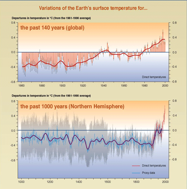
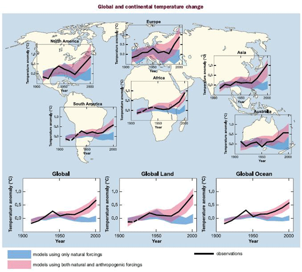
Figure 1.1 shows the temperature rising for the past 140 years (global) and the past 1000 years (Northern Hemisphere) and figure 1.2 shows the global and continental temperature change from 1901 to 2000.
Figure 1.1 - The Earth’s surface temperature has increased by about 0.6oC over the record of direct temperature measurements (1860–2000, top panel)—a rise that is unprecedented, at least based on proxy temperature data for the Northern Hemisphere, over the last millennium (bottom panel). In the top panel the global mean surface temperature is shown year-by-year (red bars with very likely ranges as thin black whiskers) and approximately decade-by-decade (continuous red line). Analyses take into account data gaps, random instrumental errors and uncertainties, uncertainties in bias corrections in the ocean surface temperature data, and also in adjustments for urbanization over the land. The lower panel merges proxy data (year-by-year blue line with very likely ranges as grey band, 50-year-average purple line) and the direct temperature measurements (red line) for the Northern Hemisphere. The proxy data consist of tree rings, corals, ice cores, and historical records that have been calibrated against thermometer data. Insufficient data are available to assess such changes in the Southern Hemisphere.[2]
Figure 1.2 - Comparison of observed continental- and global-scale changes in surface temperature with results simulated by climate models using either natural or both natural and anthropogenic forcing. Decadal averages of observations are shown for the period 1906-2005 (black line) plotted against the centre of the decade and relative to the corresponding average for the 1901-1950. Lines are dashed where spatial coverage is less than 50%. Blue shaded bands show the 5 to 95% range for 19 simulations from five climate models using only the natural forcing due to solar activity and volcanoes. Red shaded bands show the 5 to 95% range for 58 simulations from 14 climate models using both natural and anthropogenic forcing.[1]
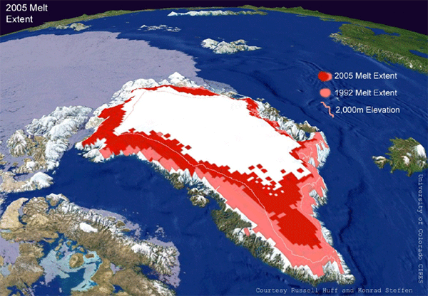
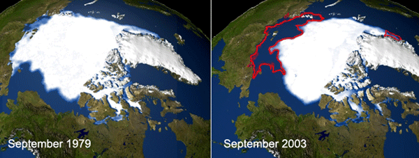
Due to the temperature rise, the ices and glaciers are melting. Figures 1.3 to 1.7 show the pictures of ices and glaciers melting since year 1970 until 2005.[21]
Figure 1.3 - Data gathered by a pair of NASA satellites orbiting Earth show Greenland continued to lose ice mass at a significant rate through April 2006, and that the rate of loss is accelerating, according to a new University of Colorado at Boulder study. The study indicates that from April 2004 to April 2006, Greenland was shedding ice at about two and one-half times the rate of the previous two-year period.
Figure 1.4 - The ice in the North Pole has shrunk for the fourth year in a row, to "the lowest extent of ice cover for more than a century". This is according to scientists from the National Snow and Ice Data Center (NSIDC), Boulder, Colorado. They also warned that "the shrinkage could lead to even faster melting in coming years." The data shows that since 1978 the artic ice has lost 2 million square kilometers to the current are of 5.35 sq km.
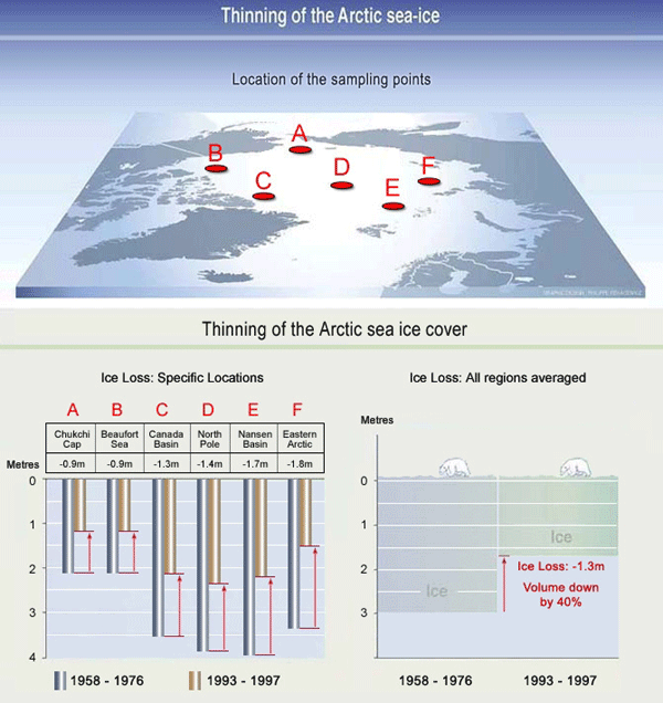
Figure 1.5 - Since 1958, submarines have been patrolling the North Pole. During each voyage, submarine crews measure the thickness of the sea-ice draft. Scientists have evaluated this data and it shows that in the last 30 years, the average ‘draft’ or depth of the ice has decreased 40% (1.3 meters).
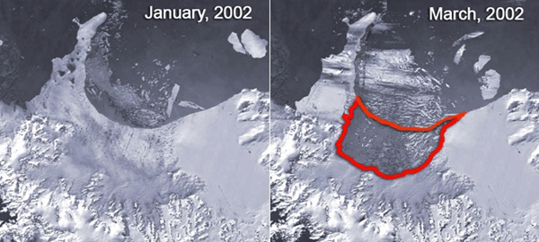
Figure 1.6 - The University of Colorado's National Snow and Ice Data Center using satellite imagery "revealed that the northern section of the Larsen B ice shelf, a large floating ice mass on the eastern side of the Antarctic Peninsula, has shattered and separated from the continent. The shattered ice formed a plume of thousands of icebergs adrift in the Weddell Sea. A total of about 3,250 km2 of shelf area disintegrated in a 35-day period beginning on 31 January 2002. Over the last five years, the shelf has lost a total of 5,700 km2, and is now about 40 percent the size of its previous minimum stable extent."
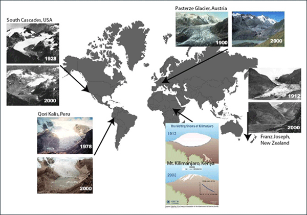
Figure 1.7 - Glaciers are large masses of ice which form in areas of high snowfall and cool temperatures, even in summer. Glaciers are located in Antarctica, or at high altitudes on the slopes of large mountains (Alpine Glaciers). Alpine glaciers are particularly susceptible to shifts in climate and respond to long term changes in the Earth’s climate. As the temperature of the Earth increases the melting at the base of the glacier happens faster than the speed at which it moves down the slope or valley.
|
|||